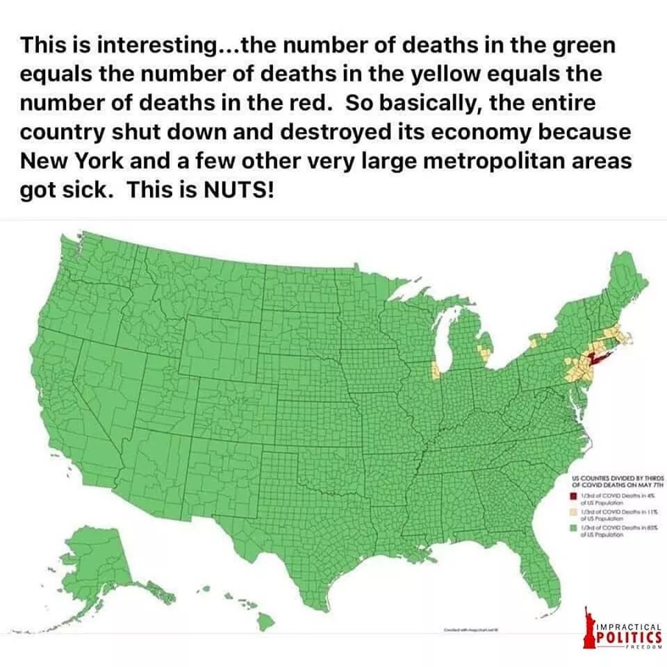
You're repeating yourself, you posted exactly this map before.
magz wrote:
Darmok wrote:
The red counties contain one third of all US covid deaths. The yellow counties contain another third of all US covid deaths. And the green counties contain the final third of all US covid deaths.

Now let's compare it to the map of urbanized areas in the US:
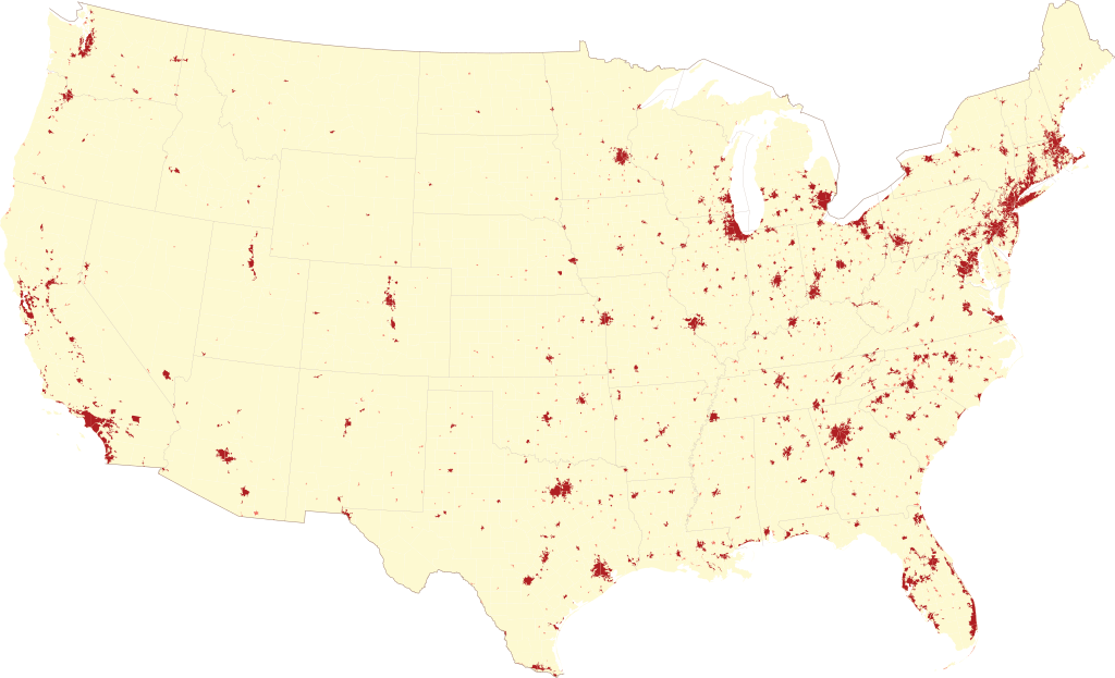
1/3 cases in the worst-hit aglomeration, 1/3 in other badly-hit aglomerations and the rest of US has the rest of aglomerations... and a lot of sparsely-populated area.
Generally, maps of <some phenomenon about people> in the US are always misleading because of very uneven population density. The same goes with e.g. maps of political preferences by state/county.
Also, two weeks is a lot when it comes to outbreak trajectory, have they updated the map in the meantime?
_________________
Let's not confuse being normal with being mentally healthy.
<not moderating PPR stuff concerning East Europe>