familiar_stranger wrote:
lau wrote:
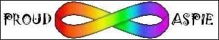
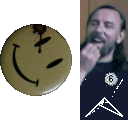
From nearly two years ago, I came up with:

I still quite like it.
looks like it could be seen as 'outisde the box' which those with autism almost always get described as... it could work. would you mind if i took the design and added some ideas?
Feel free... in a sense.
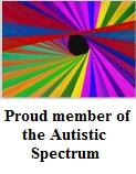
I think, at the time, the idea under discussion was an emblem of some sort that was extremely simple, so that it could be used in a whole range of situations.
If you view the above as an icon, it is still very recognisable. Try just viewing the image, when it should appear as the icon in your tab - i.e. scaled down to 16x16 it still works.
Another curiosity was that I felt that it not only would work as a badge, or small stud, but the plain outline would then be recognisable as well (i.e. from the back).
=========
Anyway... I got carried away, and here's the ODG original file:
http://www.bergbland.info/aspie/images/
_________________
"Striking up conversations with strangers is an autistic person's version of extreme sports."
Kamran Nazeer